We have a lot of good things here at SCT. Written analysis? Got it. Numbers-y stuff? Got it. Video? Now that Shorty’s joined us, got it.
But you know what we don’t have a lot of? Charts. Which is a strange, because SuperCoach is a numbers game, and often a chart or graph can convey a numerical story a lot more effectively than numbers or equations alone.
So, the aim of this column is to try and fill that gap. Each week, I’ll put up a few interesting SuperCoach-related charts. Most weeks, most of the charts will likely be directly relevant to that particular upcoming round, but occasionally there might be something a tad more general.
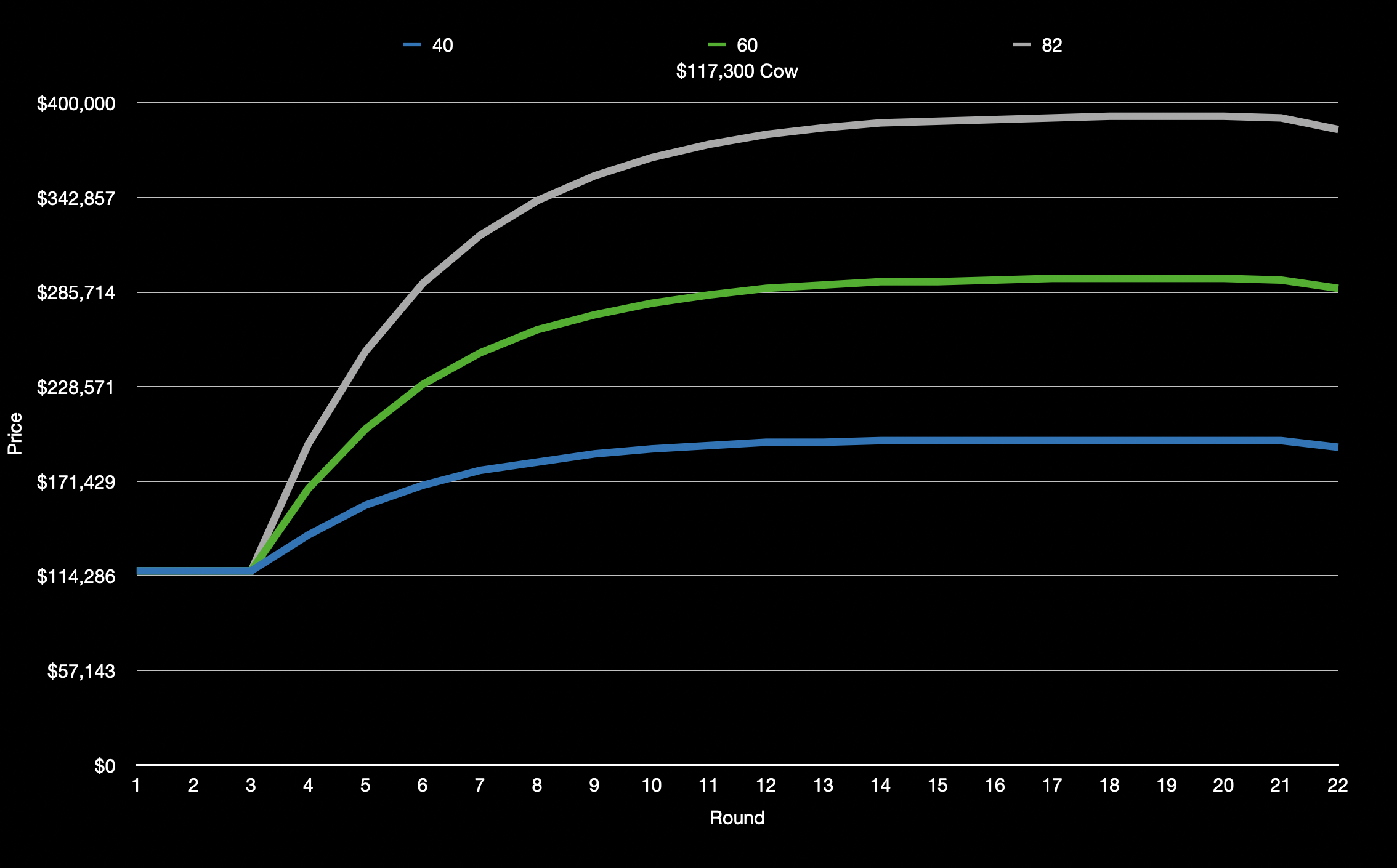
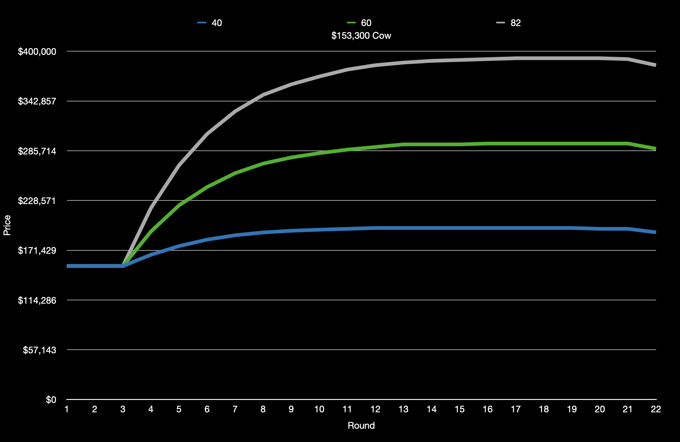
Starting us off this week, however, is a visualization of cow growth. I’ve chosen three different averages – 40, 60, and 82 – and three different starting prices – $117,300, $153,300, and $207,300, which should give us a nice spread.
Note that you can open the images in a new tab if you want to view them at their full resolution.
All numbers are courtesy of Father Dougal’s excellent reference tables.

Our second set of charts this week is based on another concept first introduced to us by Father Dougal – breakouts and frogs.
There are of course many things that can influence a player’s SuperCoach average besides their raw footballing ability, but a (male) footballer’s physical peak typically runs from the age of 23 to 28, or 25 to 30 if they’re a ruck or KPP.

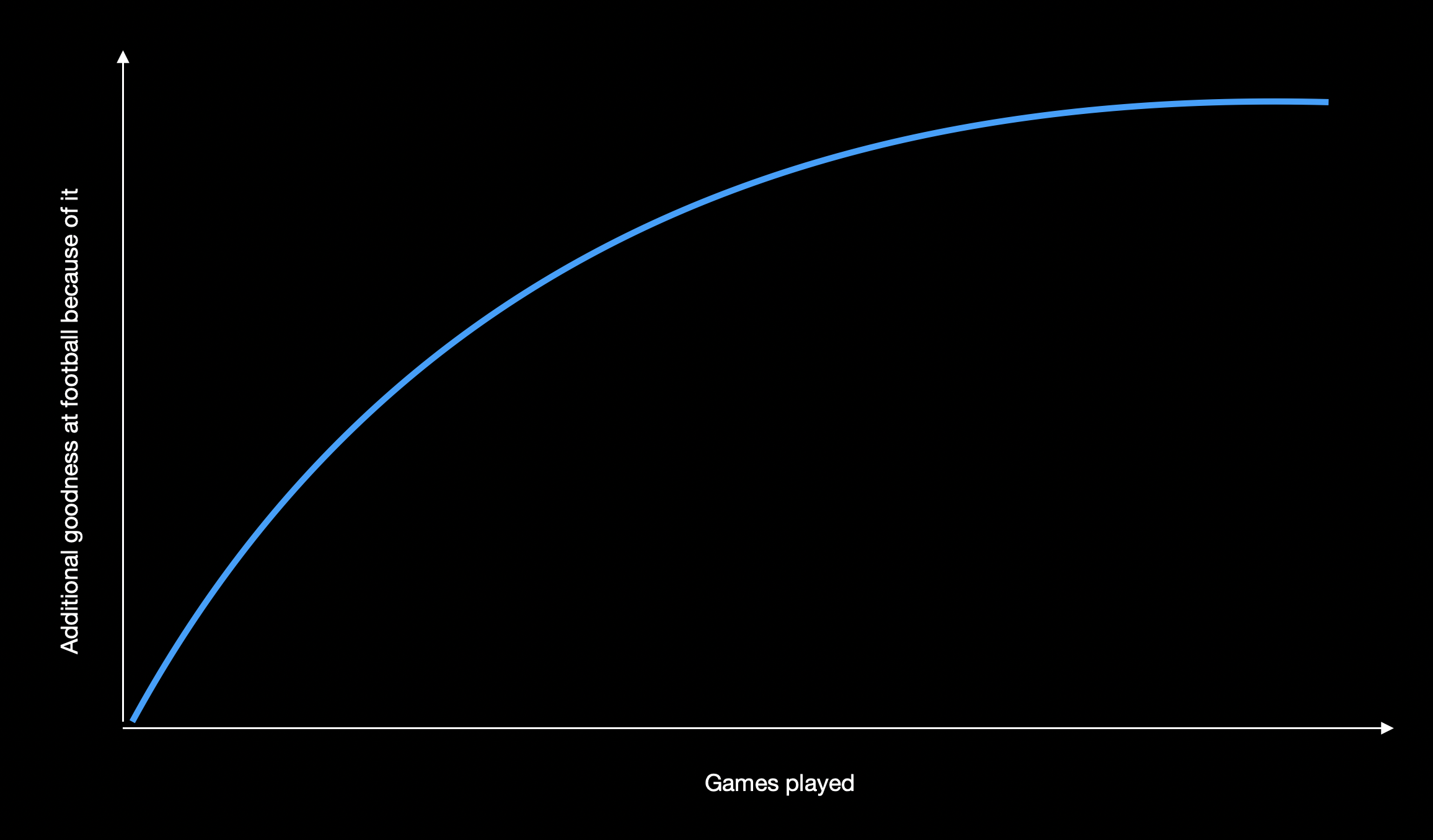
Physical maturity isn’t the only thing that comes with age, however: players also become more experienced. This experience is subject to somewhat diminishing returns – all other things being equal, there’s a much bigger difference between a 0 game player and a 100 game player than there is between a 200 gamer and someone who’s played 300. So the extra footballing ability that comes with experience probably looks something like this:
Adding the two together, you get something like the following…
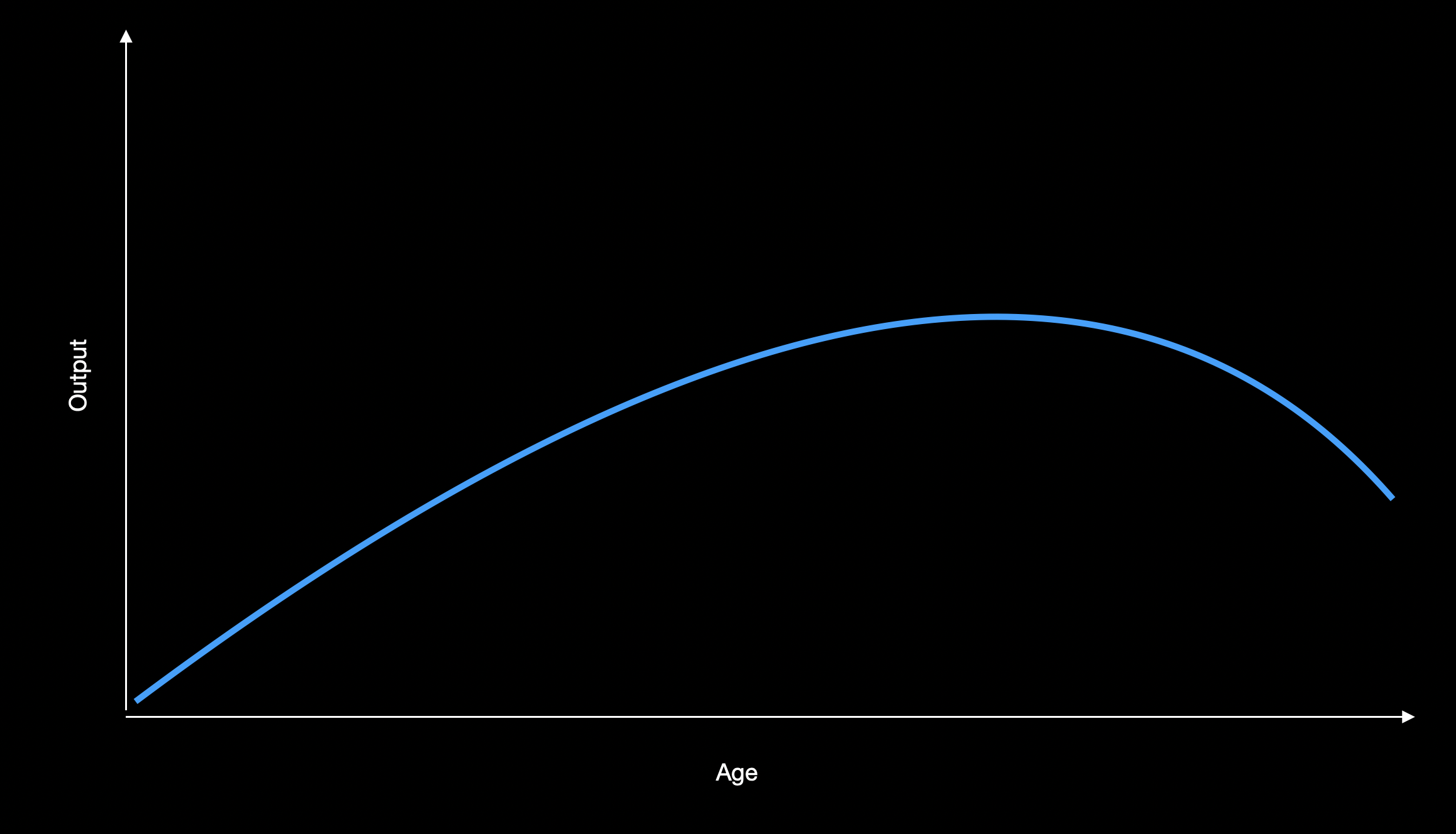
…which closely resembles the typical career trajectory of most footballers, assuming they stay on an AFL list long enough to get to the back half of that curve.
The above shape also suggests a tendency towards players having career-best seasons at the end of their physical prime (around the age of 30 for rucks and KPPs, and around 27 for everyone else, give or take a year), which happens pretty often in the real world.
Below are some players charted by their SuperCoach average at a given age.
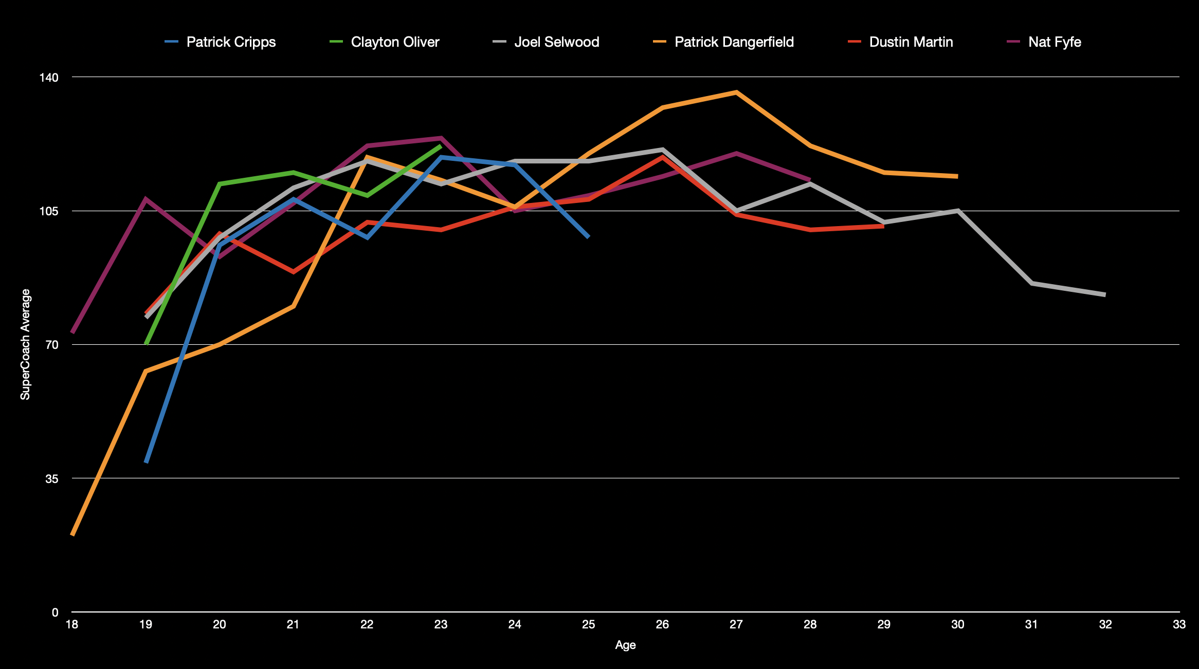
Notice the shape?
Some of the big men I chose for this are/were a tad injury-prone (as big men often tend to be), so a lot of the lines in the next chart aren’t as clean as those above, but, once again, the general shape is there.

What should we make of this? More than anything, if you are thinking of bringing in a player you think might be on the verge of breaking out, or if you’re thinking of dumping a player because you think they might suddenly be past it, have a think about where they fit into the above. You might be right – or it might just be a purple patch or form slump. Hopefully the above charts will help you figure out which is more likely.
That’s all I’ve got for you today. This column will probably evolve a bit over the next few weeks and months as it becomes clearer what people like or find useful. You can help fast track this: what kinds of things would you like to see visualized over the coming weeks? Let me know in the comments below!

Great stuff…much appreciated. The breakout by age chart is quite telling. I’m not sure if it’s appropriate here but i find visualising the heat maps showing player movements quite interesting and informative. Building a database of heat map images over a period of time may help decision making when selecting players for fantasy teams.
I love a good Graph. Thanx a million TS, some fine work right there.
Your parents money was definitely Not Wasted on Your education !!
Love the info. Reckon Tues/Weds is the best time to to post it.
We are all manic now!!
Love this! More more!